The third and last article in our series Posters Throughout History. Today we will be talking about the period from Art Deco to today. In case you missed the first two articles, here are the links to Part I, and Part II.
Art Deco
By the mid-1920 various modernistic styles merged into a style called Art Deco. It was named after Arts Décoratifs, from the International Exhibition of Modern Decorative and Industrial Arts held in Paris in 1925. It combined modernist styles with fine craftsmanship and rich materials. During its heyday, Art Deco represented luxury, glamour, exuberance, and faith in social and technological progress.
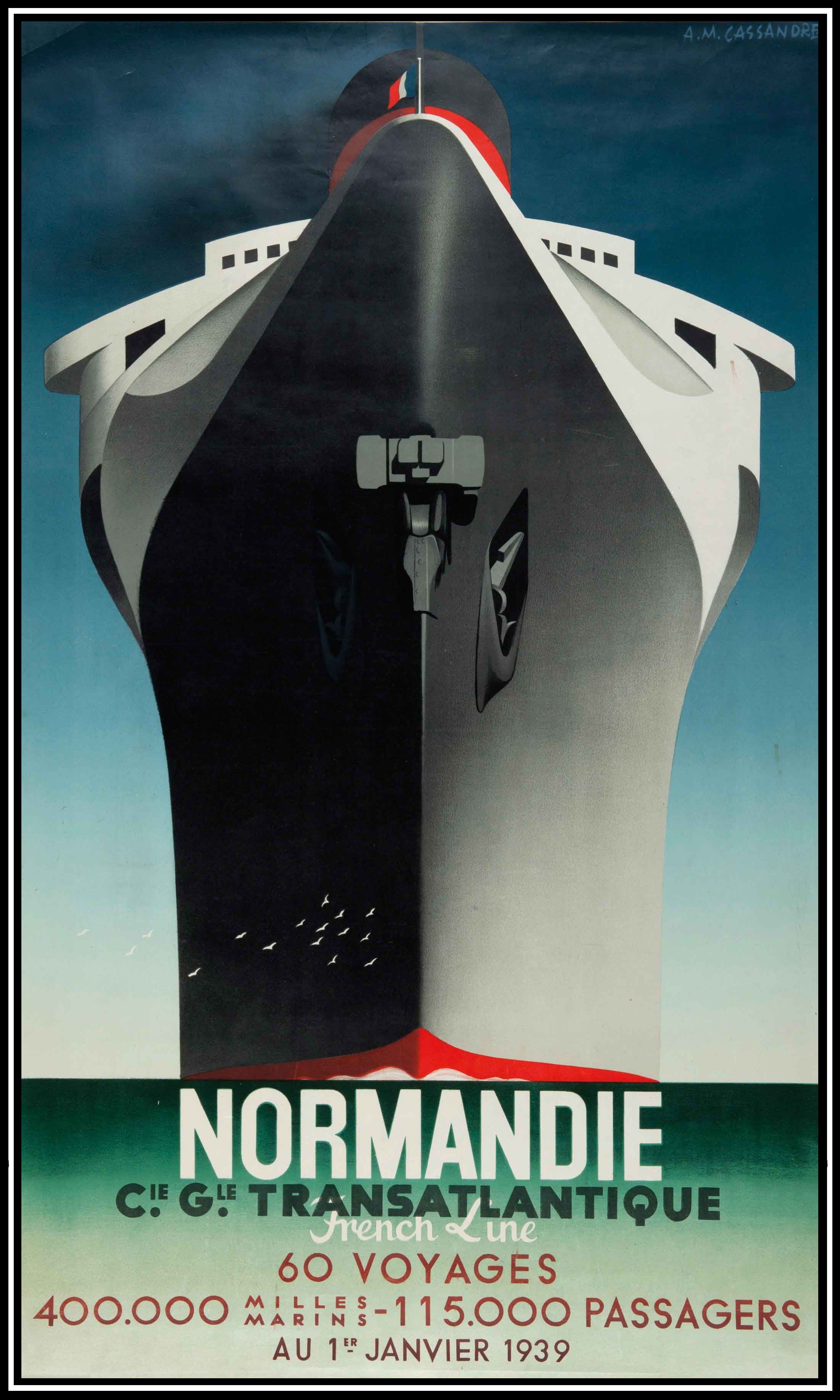
A. M. Cassandre’s “Normandie”, 1939.
Eclectic, combining elements even from opposing styles, its main inspiration was modernism. The slick lines, angular letterforms, and simplified and streamlined shapes. Themes were often speed, power, ocean liners, automobiles, etc. Art Deco spread quickly throughout Europe and to the U.S.
WWII and the aftermath
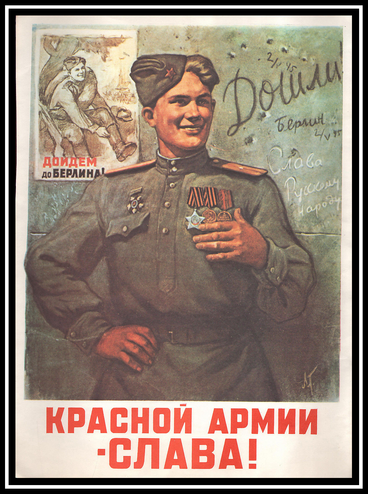
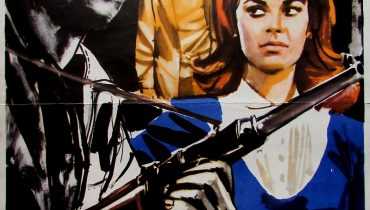
“Glory to the Red Army” by Leonid Fedorovich Golovanov. This poster can be classified as post-modern.
Once again, the poster is a means of propaganda for recruitment and war. However, this time it had the printed media and radio standing side by side with it.
At the same time, photography took the place of lithography in the visual design of posters. The use of photography in posters became as common as illustration.
During the Second World War radio and posters functioned complementarily. However, after the war, these two became competitors due to their similar functions. Having in mind the increase in television programs, it is easy to explain a decline in poster popularity.
Sachplakat
Switzerland offered the last safe haven for the lithographic poster. The government there heavily promoted the printing industry and poster art. This style was known as Sachplakat or Object Poster Style. It was developed before WWII but only gained popularity after the war.

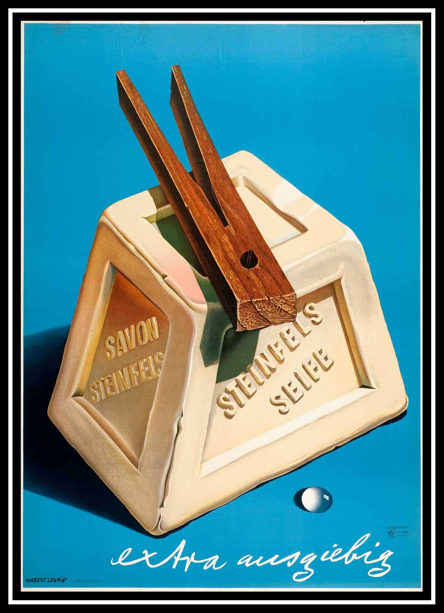
Herbert Leupin’s advertising poster is a prime example of Object Poster Style
Derived from the Plakatstil and surrealist movement, the focus was on making everyday objects into giant icons. And with good old Swiss precision, the results were often spectacular trompe l’oeil effects.
Consumer and corporate styles
With the baby boom happening in the Western world after WWII, the marketing tactics had to adapt to the new consumer generation. These changes are best recognizable in the new styles of poster art. The styles were named by the authors of “A Brief History of the Poster”- The 50s style (consumer-centric) and the International Typographic Style (corporate-centric).
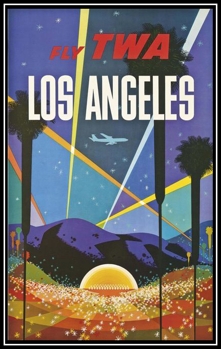
David Klein’s Fly TWA. We can easily spot the use of grids.
The 50’s style was consumer-oriented and intended for a wide audience. Therefore it was light-hearted, vivid in colors, humorous, almost cartoon-like, and a bit naïve in a way. It was non-offensive and it advertised services as well as the products. The graphic sophistication and eye-catching colors combined with visual puns and irrepressible characters and creatures made it the leading style for product advertising. The most influential poster designers of this style were Herbert Leupin and Donald Brun in Switzerland, Raymond Savignac in France, and Paul Rand in the U.S.
The International Typographic Style or the Swiss style came out of the need for worldwide brand recognition. This is best portrayed through this style’s rational, highly structured, and systematic designs. The name itself illustrates the style’s strong reliance on typographic elements, such as 1) the use of a mathematical grid to provide an overall orderly and unified structure; 2) sans serif typefaces (especially Helvetica, introduced in 1961) in a flush left and ragged right format; 3) black and white photography in place of a drawn illustration.
The style made its debut in the ‘50s in Switzerland and become the predominant graphic style in the world by the ’70s. The leading artists of this style were Muller-Brockmann, Hofmann, Nitsche, Lohse, Ruder, Poretti, Aicher, Bill.
Posters in the ’60s
As opposed to the rational typographic style, the styles of the sixties were more chaotic and revolutionary. This new illustration style borrowed the elements of Surrealism, Pop Art, and Expressionism and was more relaxed and intuitive- therefore, it paved the way for the first wave of the Post-Modernist sensibility.
The most influential schools in the ’60s were Push Pin Studios (a graphic design and illustration studio formed in New York City in 1954) and the Polish school of the poster (in Poland from the ’50s through to the ’80s, which had a heavy influence in surrealism in promoting the State-controlled theatre and cultural organizations). The blooming drug culture enabled a brief but spectacular psychedelic poster craze in the U.S., which recalled the floral excesses of Art Nouveau, the pulsating afterimages of Op-Art, and the bizarre juxtapositions of Surrealism. Meanwhile, there was a poster movement in France that took inspiration from the old Soviet propaganda posters and cartoon art.
Post-Modernism
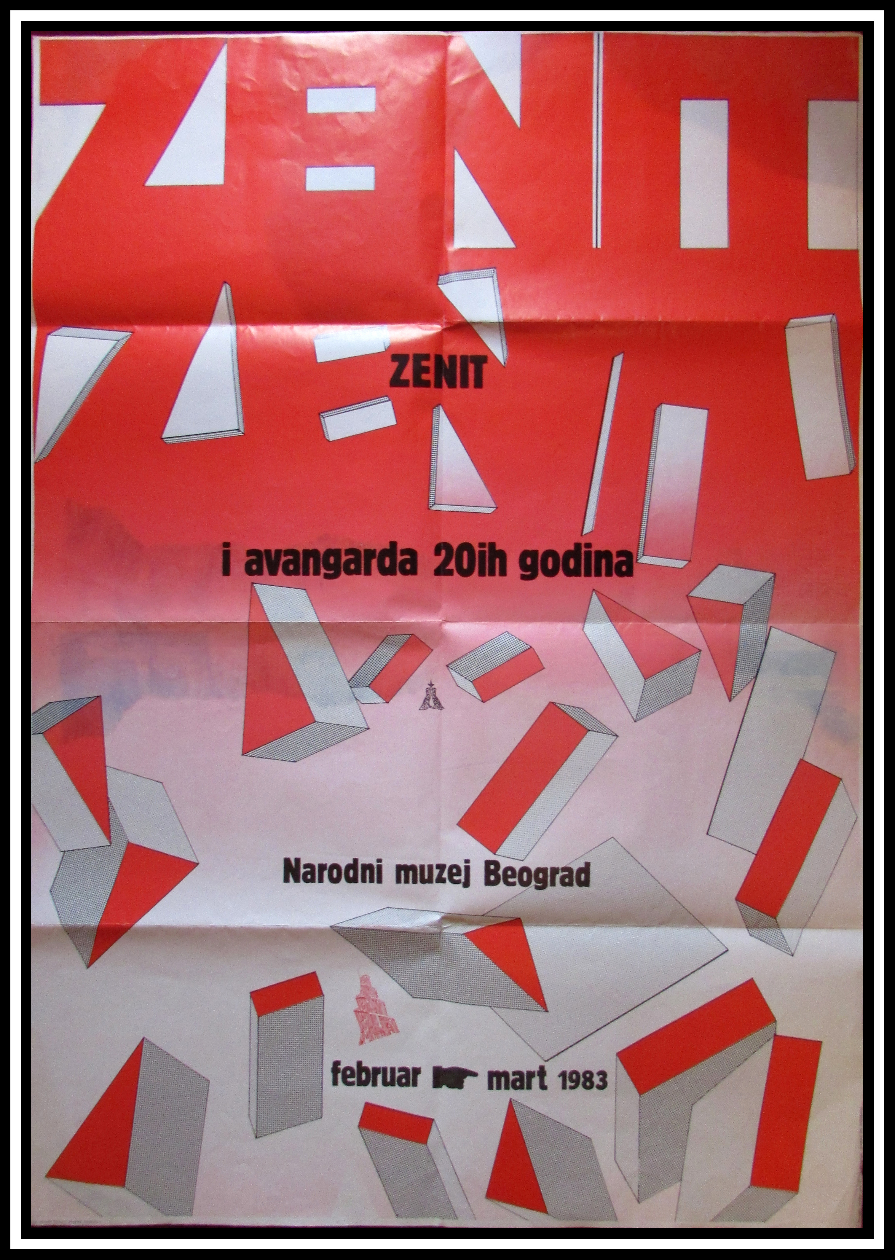
Zenit & Avant-garde in the 20’s – National Museum in Belgrade
The domination of the Swiss style, which spread worldwide rapidly after its genesis, led to a new, sort of an ‘opposing’ style in the 70s and 80s. The movement itself was much wider and it influenced the Fine arts, Literature, Philosophy, and Film-making (amongst others).
This movement is called Post-Modernism. Wolfgang Weingart, a young teacher in Basel experimented with the offset printing process to produce posters that appeared complex and chaotic, playful and spontaneous – all in stark contrast to his elders’ teachings.
His liberation of typography was an important foundation for several new styles and also for the advances in the current computer graphics around the globe. Other groups of the time weren’t as radical but followed the trend nonetheless.
Poster today
Although the poster isn’t as relevant nowadays as it was before, it still manages to find its place in modern society- on the walls of the various buildings, on notice boards, on the walls of the teenager’s rooms, and so on. With technology being easily accessible to a wide variety of people, everybody can be a poster-maker nowadays. In the modern digital world, maybe we should redefine the definition of the poster and expand its grasp onto the digital territory.
Can the poster in its digital pre-print era have all of its previous characteristics except for the physical form?
And also, can various trends on the internet like ‘demotivational posters’ and ‘memes’ be the new step in the poster evolution? Are they posters at all, or just a product of a bunch of people having too much time on their hands?
Illustrations are taken from items in our store.
As well as the International Poster gallery.